
The Brand
The Warehouse and their sister bar/restaurant The Dime have over 20 locations throughout Canada and the US.
The brand tone of voice is self deprecating, edgy and cheeky. They know exactly who they are (a premium dive bar) and they need visuals that lean into this and feel authentic.
This makes for an incredible opportunity for design as I can leverage this unique tone to create attention grabbing visuals that communicate the event themes with quirky unexpected details. This strategy effectively builds event and brand awareness while strengthening the brand love experience of throwing an incredible party while not taking themselves too seriously.
The Goal
Strengthen brand link and experience with promotional materials that drive engagement, awareness and messaging.
View other work for The Warehouse and their sister restaurant - The Dime; promo materials, core menus and feature menus.

Sandwich board, posters, feature menus and T-Shirts for The Dime on Commercial's Italian Day activation. I wanted to create something fun, festive and authentic to the 'dive bar' vibes of The Dime. The retro italian deli theme increased visibility and stood out on a busy street with lots of choices. The sandwich board had strategically large and clear text with cheeky,nods to the theme without being too 'on the nose' Italian.
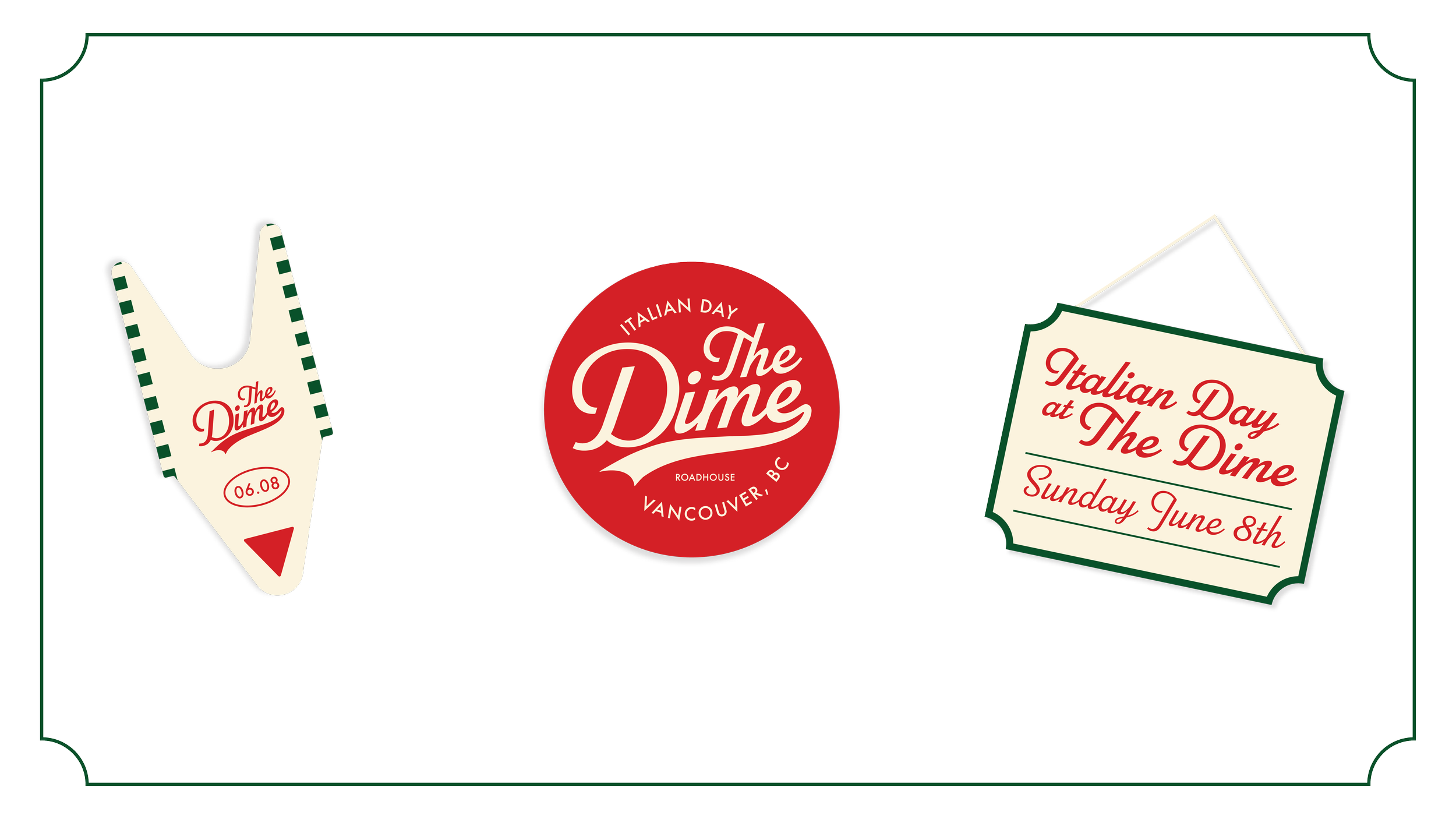

Sandwich board, posters, feature menus and T-Shirts for The Dime on Commercial's Italian Day activation.