
The Brand
The Warehouse and their sister bar/restaurant The Dime have over 20 locations throughout Canada and the US.
The brand tone of voice is self deprecating, edgy and cheeky. They know exactly who they are (a premium dive bar) and they need visuals that lean into this and feel authentic.
This makes for an incredible opportunity for design as I can leverage this unique tone to create attention grabbing visuals that communicate the event themes with quirky unexpected details. This strategy effectively builds event and brand awareness while strengthening the brand love experience of throwing an incredible party while not taking themselves too seriously.
The Goal
Strengthen brand link and experience with promotional materials that drive engagement, awareness and messaging.
View other work for The Warehouse and their sister restaurant - The Dime; promo materials, core menus and feature menus.
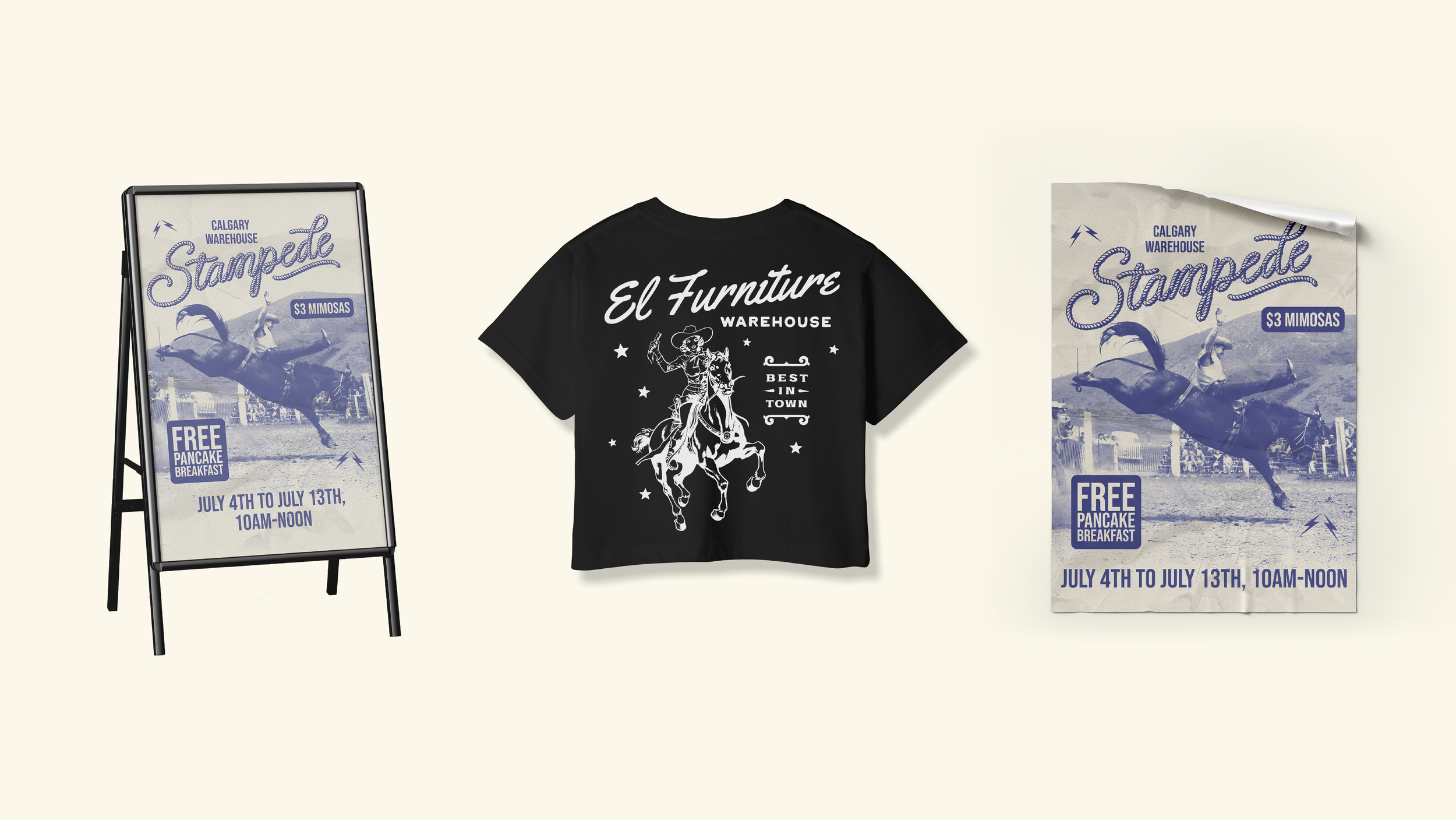
Promotional materials for Calgary Stampede event

Promotional materials for Calgary Stampede event
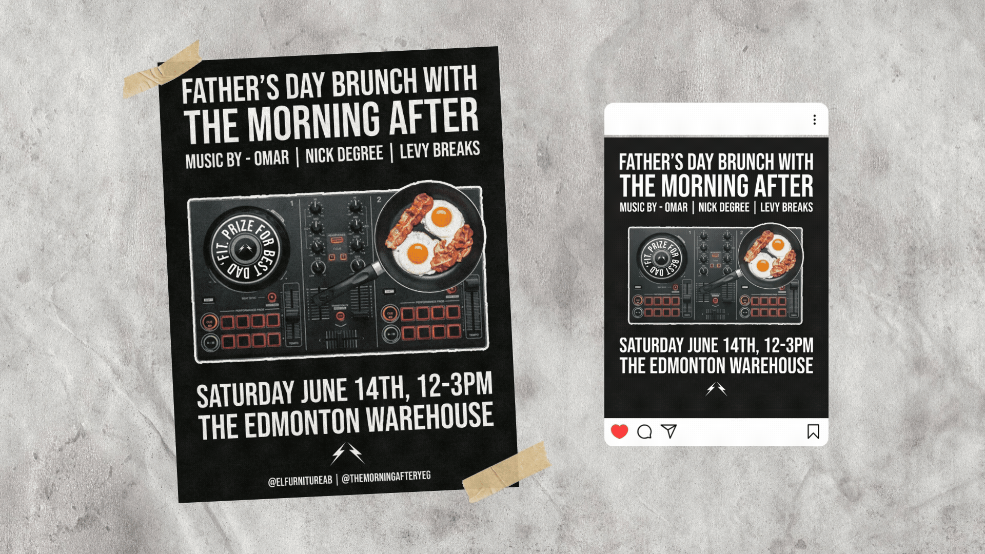
Promotional materials for a Father's Day brunch and DJ event.
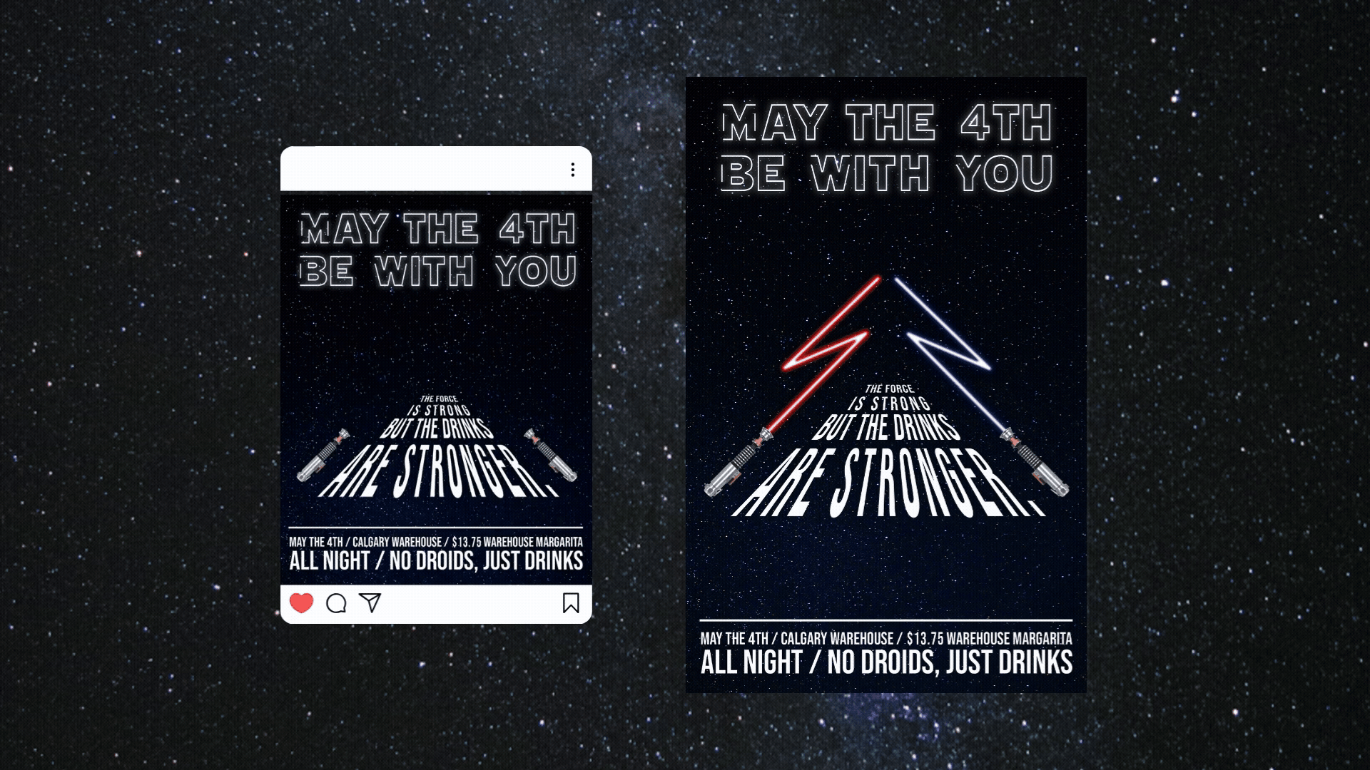
Promotional materials for a May the 4th event. Featuring light sabres bent into The Warehouse lightning bolts logo.
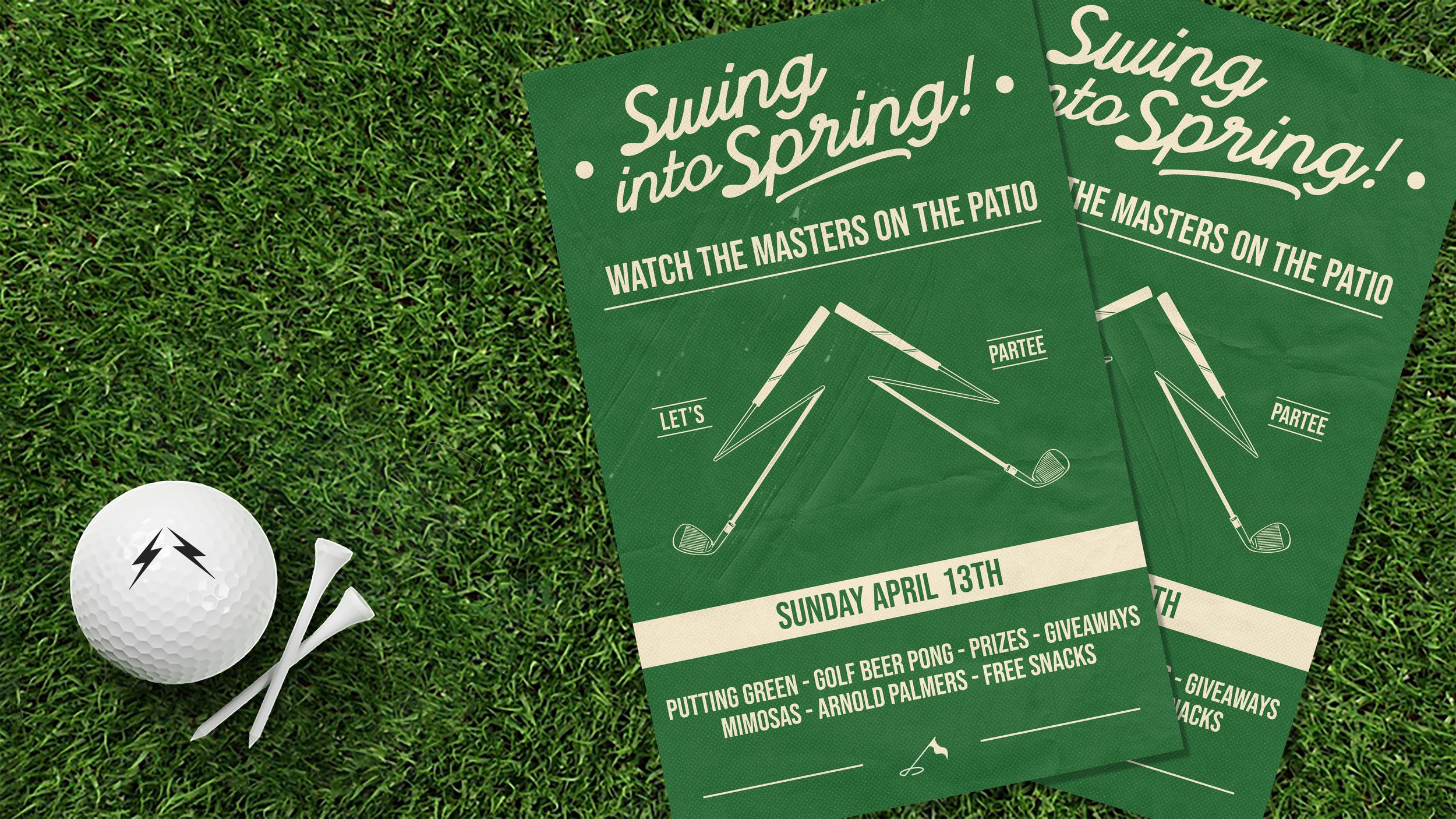
Poster for The Masters party at the Edmonton location. Featuring hand illustrated golf clubs bent into The Warehouse lightning bolts logo.

Posters for St. Patrick's Month promo. This poster is very tongue in cheek (an intentionally low-fi composition of St. Patrick holding a tray of Jameson shots) - but fits the brand perfectly.
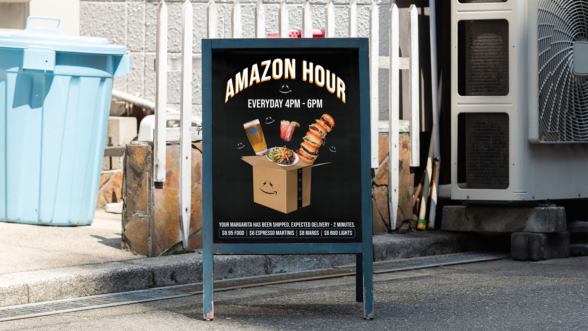
Sandwich board and poster for Amazon Hour at the Warehouse in Seattle (located in the Amazon building)
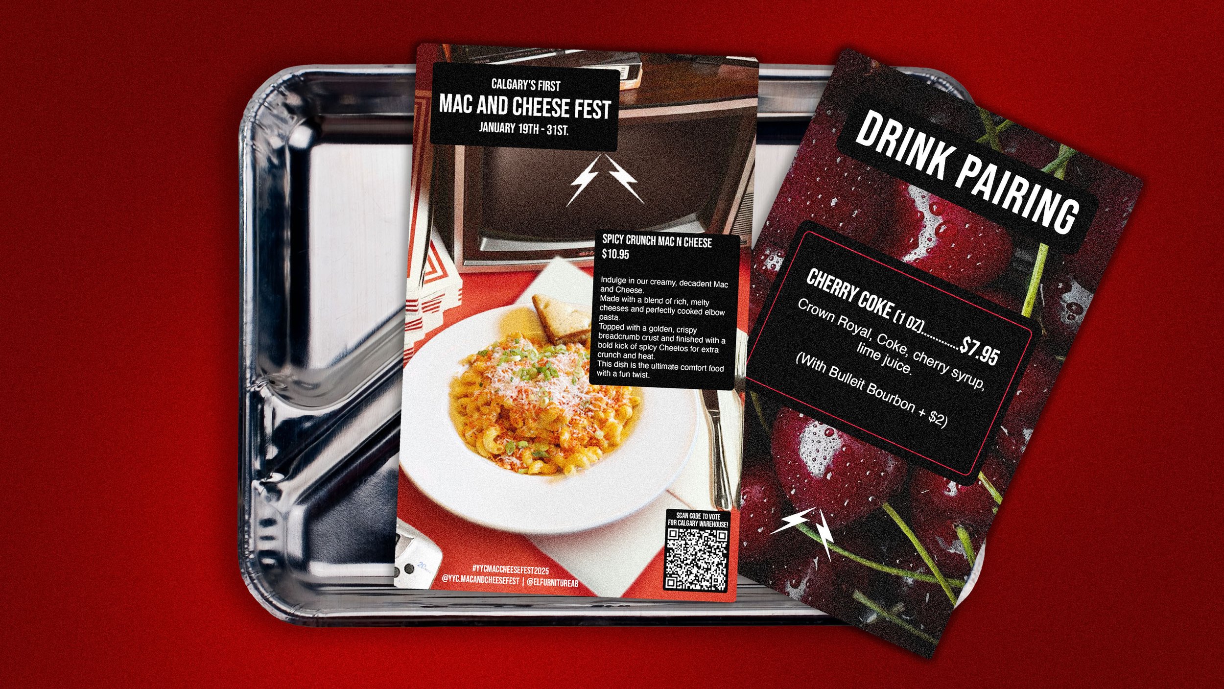
Menu cards for The Calgary Warehouse's entry into the annual Mac N Cheese Fest.

Poster for 00s themed sleepover night at The Dime.
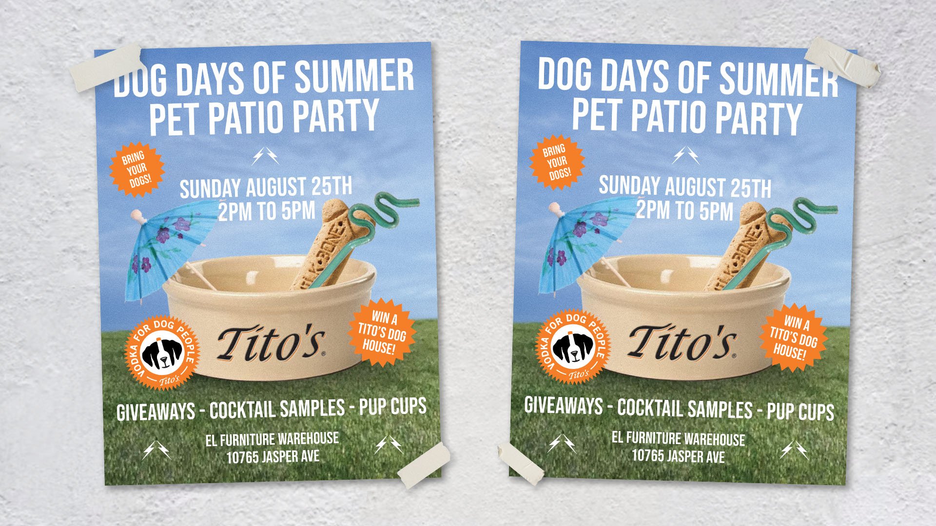
Poster for Tito's sponsored pet patio party.
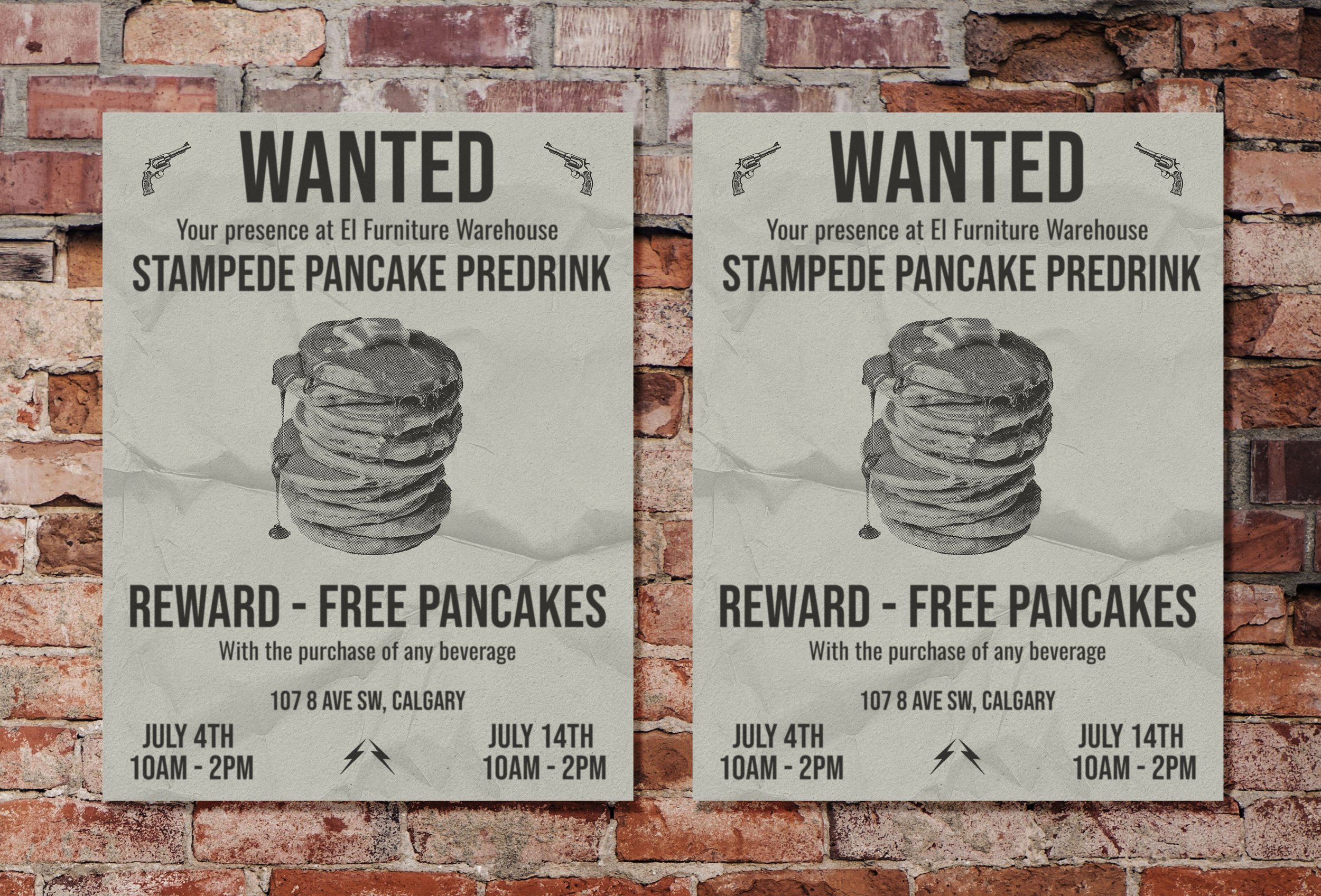
Wanted poster for Stampede Pancake Party at the Calgary location.