
The Brand
The Warehouse and their sister bar/restaurant The Dime have over 20 locations throughout Canada and the US.
The brand tone of voice is self deprecating, edgy and cheeky. They know exactly who they are (a premium dive bar) and they need visuals that lean into this and feel authentic.
This makes for an incredible opportunity for design as I can leverage this unique tone to create attention grabbing visuals that communicate the event themes with quirky unexpected details. This strategy effectively builds event and brand awareness while strengthening the brand love experience of throwing an incredible party while not taking themselves too seriously.
The Scope
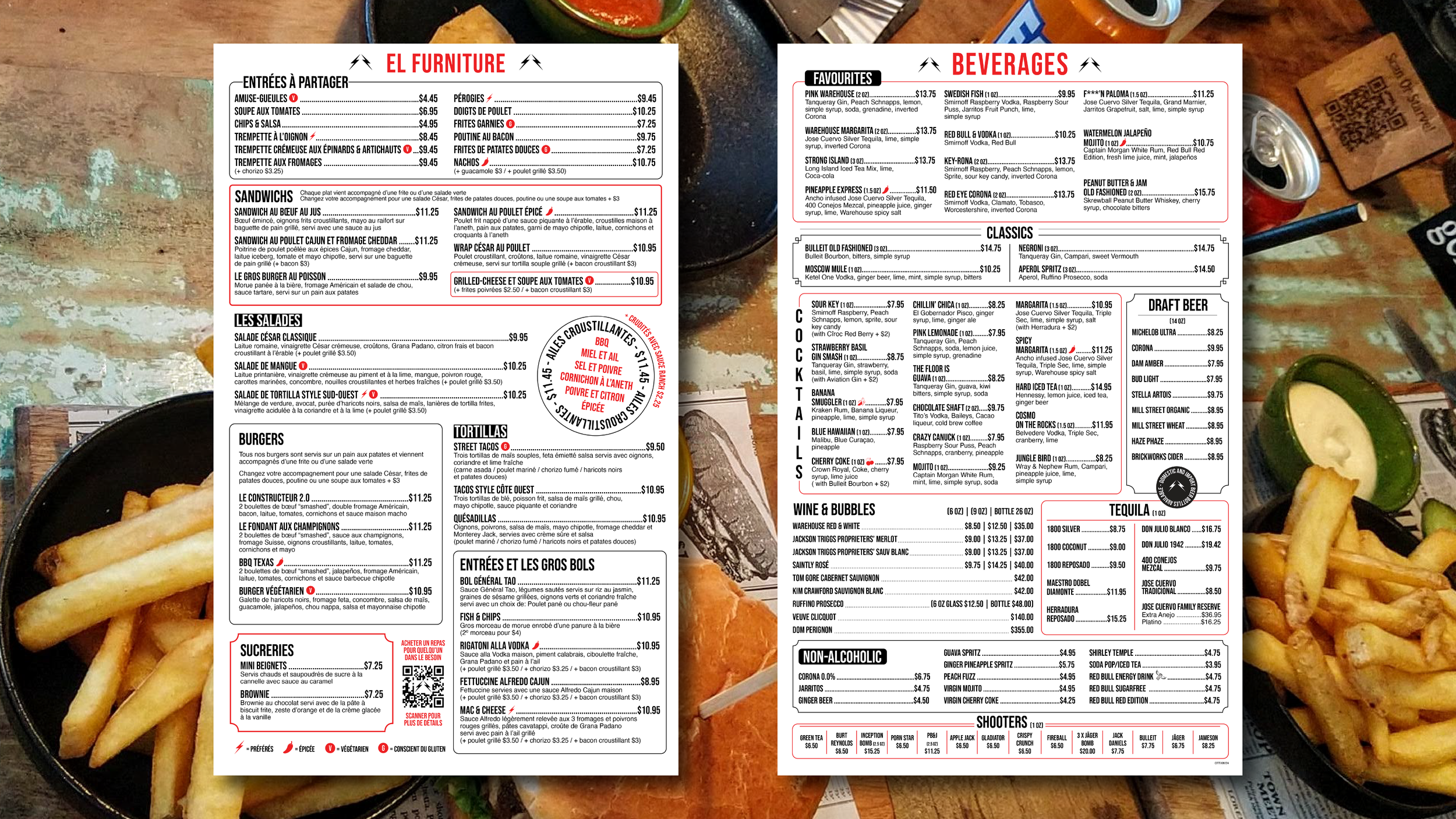
Complete redesign of all food and beverage menus in English and French for use across Canada and the USA.
Each menu was slightly different as the beers, wines, cocktails and some food items are tailored to each location.
This presented a lot of design and layout challenges as each menu needed to be engineered to allow for differences in copy while keeping the overall look and balance of the menus consistent.
View other work for The Warehouse and their sister restaurant - The Dime; promo materials and feature menus.
English double sided food and drinks menus for use at 14 locations across Canada and the USA
French double sided food and drinks menus for use at 5 locations across Quebec
English food and drinks menus

French food and drinks menus