
The Brand
The Warehouse and their sister bar/restaurant The Dime have over 20 locations throughout Canada and the US.
The brand tone of voice is self deprecating, edgy and cheeky. They know exactly who they are (a premium dive bar) and they need visuals that lean into this and feel authentic.
This makes for an incredible opportunity for design as I can leverage this unique tone to create attention grabbing visuals that communicate the event themes with quirky unexpected details. This strategy effectively builds event and brand awareness while strengthening the brand love experience of throwing an incredible party while not taking themselves too seriously.
The Goal
Strengthen brand link and experience with promotional materials that drive engagement, awareness and messaging.
View other work for The Warehouse and their sister restaurant - The Dime; promo materials, core menus and feature menus.

Materials created for the nationwide 50/50 Mondays promotion.
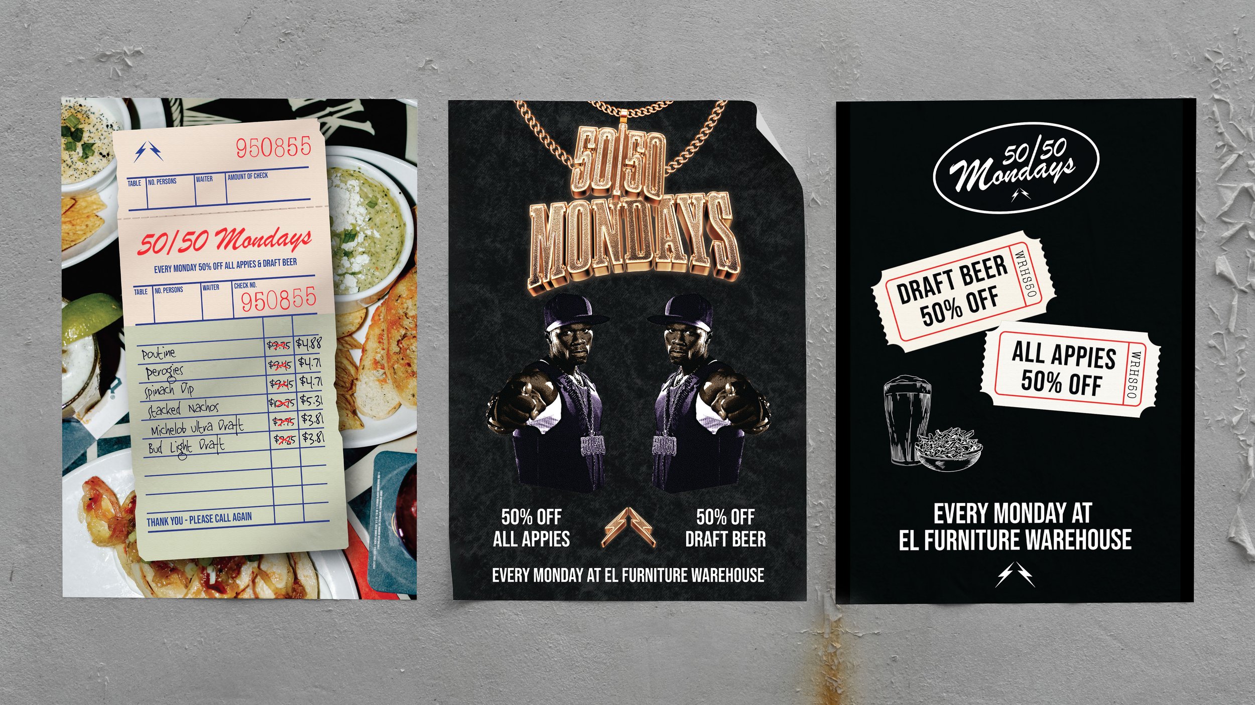
English posters for the nationwide 50/50 Mondays promotion

T-Shirts/staff uniforms for the nationwide 50/50 Mondays promotion
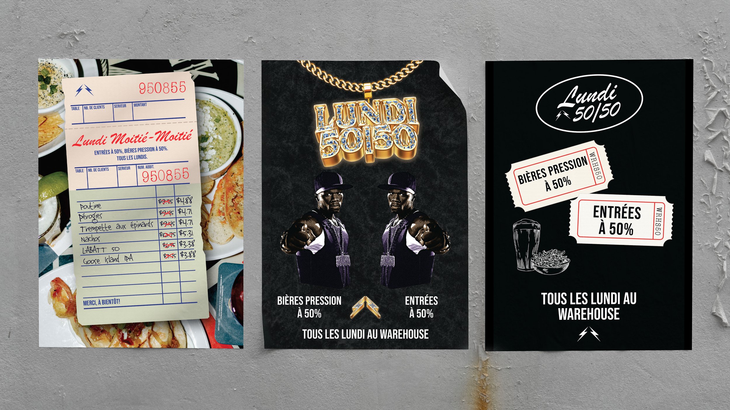
French posters for the nationwide 50/50 Mondays promotion

Postcards for the nationwide 50/50 Mondays promotion
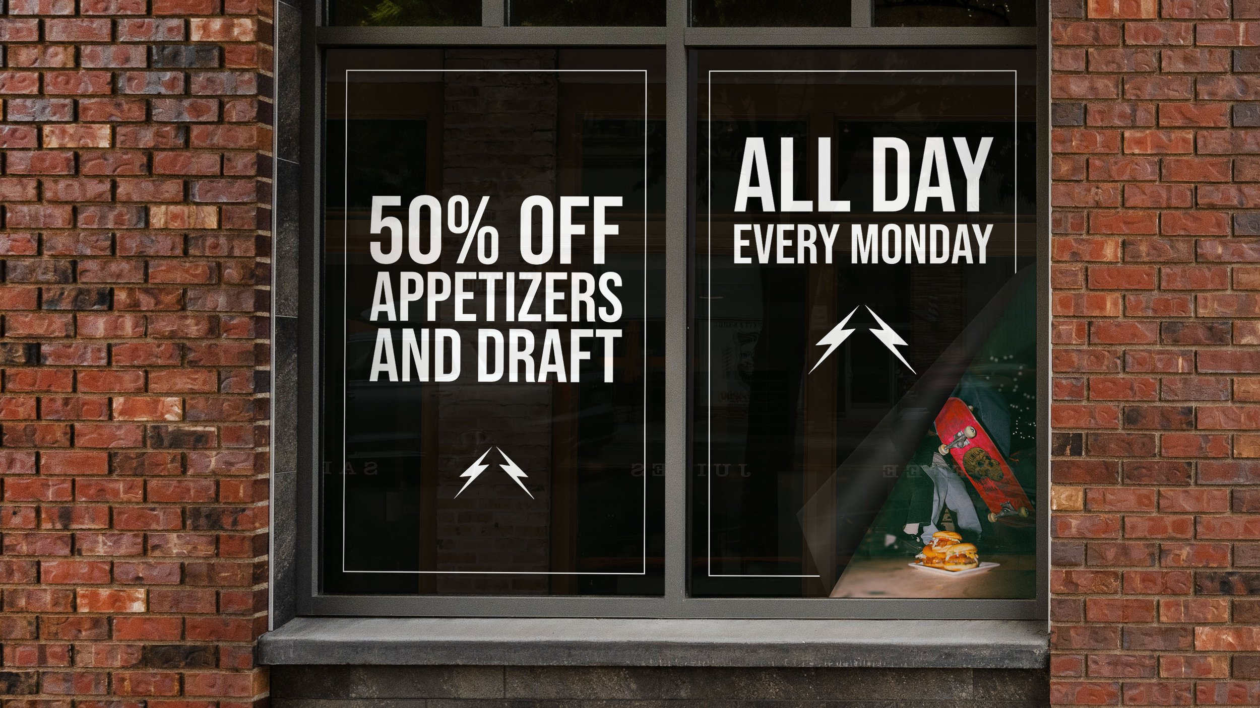
Window vinyls to provide privacy for the kitchen of the Edmonton location that double as promotion for the nationwide 50/50 Mondays promotion. The right sticker provides a sneak peek as to the classic Warehouse debauchery happening inside.